Every time I run a presentation skills training session, people want to know how to become more confident.
Depending on which survey you believe, public speaking is either just ahead of or just behind spiders, heights, snakes and flying in the top 10 things that scare the hell out of human beings.
And when you think about it, the fear is probably justified.
How many of us can honestly say we look forward to another PowerPoint presentation? ‘Death by PowerPoint’ is so common it’s become a cliche, conjuring up images of endless slides full of bullet points in a font just too small to read – so the presenter spends eternity 30 minutes with his head craned backwards over his shoulder, reading the text to us in a monotone.
It doesn’t have to be like this.
Would you believe me if I told you PowerPoint can be a very creative medium to work in? Or that I look forward using PowerPoint (or Keynote on my Mac) whenever I have a new presentation to put together?
How would you like to not only overcome any nervousness about presenting, but to enjoy using PowerPoint as an expression of your creativity — and an opportunity to wow your audience?
Here’s a book that will help you do just that.
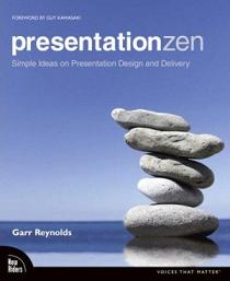
Presentation Zen by Garr Reynolds
As the name suggests, Presentation Zen is about presenting with simplicity, authenticity and presence. If I were a manager, I wouldn’t allow anyone to have PowerPoint installed on their computer until they had read this book. It’s that important.
The book and the fabulous Presentation Zen blog grew out of Garr Reynolds’ frustration with the ‘death by PowerPoint’ approach:
I realised that something needed to be done to end the scourge of bad PowerPoint slides and the lifeless narration that accompanies them, and that I could do something to help. In Japan, just like everywhere else in the world, professionals suffer through poorly designed presentations on a daily basis. Presentations in which the slides often do more harm than good. It is not enjoyable, and it is not effective. I knew that if I could begin to help others look at preparation, design, and delivery of so-called “PowerPoint presentations” in a different way, perhaps I could do my small part to help others communicate far more effectively.
Presentation Zen offers its solution in three stages:
- Preparation
- Design
- Presentation
1. Preparation
 Photo by Amir K
Garr makes the often-overlooked point that there is more to a presentation than PowerPoint slides — and we may not need them at all. The main reason most presentations are so mediocre is that we don’t stop to consider what we really want to say, and how we can best communicate it to our audience.
So instead of rushing to fire up PowerPoint and start typing bullets, Garr encourages us to leave the computer alone and start by Planning Analog — asking ourselves important questions and scribbling down the answers on paper or a whiteboard:
Who is the audience?
What’s their background?
Why was I asked to speak?
What do I want them to do?
What visual medium is most appropriate for this particular situation and audience?
What’s the story here?
What is my absolutely central point?
Once you have the answers to these questions, time to start Crafting the Story. Why is storytelling important?
Good presentations include stories. The best presenters today illustrate the points with stories, often personal ones. The easiest way to explain complicated ideas is through examples or by sharing a story that underscores the point. Stories are easier to recall for your audience.
I know exactly what Garr means. When I first started giving presentations, about 10 years ago, I realised pretty quickly that what my audience responded to most strongly was the stories I told. And it was no coincidence that as soon as I became immersed in telling a story, I became animated and full of enthusiasm.
Stories are engaging and memorable because they present ideas via a human situation — usually involving some kind of drama or struggle and its resolution. They arouse powerful emotions in the presenter and audience — which makes them motivating as well as memorable.
If I could only offer one piece of advice in a presentation skills training session, it would be: tell a story that means something to you. It could be from your own experience, but it doesn’t have to be. If a story resonates for you personally, that will come across when you tell it for your audience.
2. Design
If — and it’s a big ‘if’ — you’re going to use slides to accompany your presentation, you can stand out from the vast majority of presenters by adopting Garr’s radically simple approach to slide design.
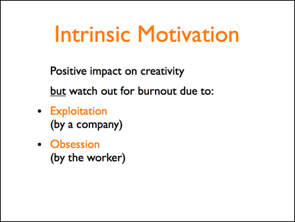
Here’s a slide I made a few years ago:
I trust that makes it clear I’m not a graphic designer. 🙂
In my defence, the slide isn’t covered with an overwhelming amount of text – but Garr made me realise that slides like this were of more value to me than they were to my audience.
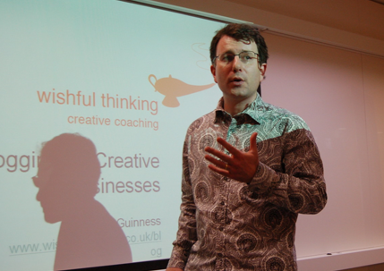
Here’s what I did with that slide when I talked about the same subject in a recent presentation:
 Photo by aleksey.const
It’s not perfect, but there’s no question which slide will make a bigger impression on an audience.
Notice how the words on the second slide have been reduced to the bare minimum. The image is the most important element – it should illustrate the presenter’s words in an engaging and memorable way. The second slide has more impact because of Garr’s principle of Amplification through Simplification.
As I say, I’m not a graphic designer but I’ve learned a huge amount about slide design from Garr, including:
- why you should include as little text as possible
- how to avoid using bullet points (on slides, not blog posts 🙂 )
- the importance of empty space
- enhancing design using contrast, alignment, repetition, and proximity
Since adopting these principles, I regularly see the words ‘Great slides!’ on feedback forms after my seminars. A trained graphic designer would obviously be able to improve on my efforts, but Garr and Seth Godin have shown me that producing attractive slides is within my reach. And if a wordsmith like me can do it, so can you.
Where can you find images to use in your presentations? Garr recommends iStockphoto.com, a website where you can license high-quality images for a few dollars/pounds each. I use iStockphoto a lot and second his recommendation — it offers a wide range of clean and clear images of just about anything you can imagine.
My only criticism of iStockphoto is that the images can be a bit corporate and antiseptic — if you want something a little edgier (and free) then read Skellie’s fantastic tutorial on using Creative Commons images from Flickr. Once you’ve got the hang of that, I recommend Compfight, an excellent way to search for Creative Commons licensed images.
3. Delivery

Counterintuitively, the section on presentation delivery is the shortest in Presentation Zen — with good reason. If you’ve done a good job of preparing a presentation on designing your slides, most of the problems associated with presenting will have melted away.
The principles that will make your presentation memorable to an audience will also make it easy for you to remember it — so you won’t need the crutch of having all your notes crammed onto your slides in bullet points. As soon as you see the image on each slide, it will trigger the stories and ideas associated with it. And if you’ve chosen good stories to tell, you’ll be brimming with enthusiasm and ready to share them with your audience — transforming your stage nerves into excited anticipation.
So Garr focuses on the two things that are absolutely essential when you take the stage:
- Being in the Moment. It doesn’t matter if you fluff your lines or forget one of your examples. It doesn’t matter if the slides down look quite right on the projector, or your video doesn’t work. But it does matter if you spend your precious time on stage worrying about these things instead of being present in the moment. When you are present, easy to be yourself, to be relaxed and spontaneous — and if necessary, to improvise. Presence is what brings the real magic into your performance.
- Connecting with the Audience. You are not there to transfer information to your audience. You could do that via e-mail. You are there to connect with them on an emotional level and inspire them with the importance of what you are telling them. More than that — to prompt them to go away and do something about it. Otherwise why bother turning up?
I’ve screwed up all kinds of things during presentations — forgetting key points, tripping over cables, pressing the wrong button and causing the slideshow to vanish. I’ve even turned up to discover that the topic I’d been briefed on and had diligently prepared was completely irrelevant to the people in front of me. My experience is that an audience will forgive all of these things as long as you are fully present and sincerely committed to giving them something of value.
So prepare thoroughly — but be prepared to tear up your scripts and improvise a completely new presentation from scratch. I’ve done this, and it was surprisingly well-received — not because it was a perfect presentation (far from it) but because the audience could see me making an effort to help them with their real needs. They joined in and helped me out — and I found I wasn’t giving a presentation to an audience, it was something we were creating together.
Follow the principles in Presentation Zen, and you can expect to make a similar connection with your audience. The best part? You’ll all be having a lot more fun while you learn.
Like all great presentations, Presentation Zen is carefully structured, beautifully designed and contains enough information to help you without overwhelming you. It’s a great complement to the stream of free presentation skills training tips on offer at the Presentation Zen blog.
You and Your Presentations
Do you enjoy creating and delivering presentations?
What do you think of the Presentation Zen approach?
What are the elements of a great presentation?
Would you like your team to be more creative and effective presenters?
Ask me about helping them with my presentation skills training workshop Creative Presentation Skills.


Great advice…
James Cherkoff’s last blog post..I Am An Outbound Spam Filter
Thanks James, hope life is good for you.
Excellent post! I’m preparing a short presentation on “The 5 Biggest Mistakes Business Owners Make When Trying To Get Organized” (there’s got to be a catchier title, but I can’t quite find it), and I’m absolutely going to keep all of this advice in mind, and probably get the book, too!
Hey Mark,
Great post! I would hesitate summarizing a book summarizing presentation design so well, but you have done a great job here.
I am a graduate student in neurophysiology in Boulder, CO and have also found Garr’s text very helpful in my realm of scientific presentation. Every week I go to a 45-min seminar in my Department eager to see how these researchers will use their opportunity to talk about their research (presentations are all about opportunities right?).
You can checkout some of my slides on Scribd and see how many “zen” principles you can find!
New Wishful Thinking Blog Subscriber,
– Mike Pascoe
I read the book for the first time this month and was very impressed. I especially loved the idea of a leave-behind document so that you can feel comfortable with those “impression” slides.
I don’t do much presentation work currently and the few I do are in a prescribed bullet point slide formula that is a short version of a longer document. However, I would have loved to have used this style when I was giving presentations in the past and will definitely be giving it a try when the opportunity presents.
Beth Robinson’s last blog post..Thinking in Systems: What is a System?
@Catherine – Thanks. I like your title, it makes it clear what you’re going to address.
@Neil – I agree science is a prime candidate for ‘amplification through simplification’! Some nice slides in your files.
@Beth – Yes, doing a takeaway document takes a little extra time but it relieves you of the pressure to include all the information on the slides. So your audience gets a better live experience and a better summary afterwards.