Back to the Slides and Props section Page
The Problem with PowerPoint
PowerPoint has a lot to answer for.
Because of its ready-made design templates, and a widespread assumption that we have to use them, audiences have to sit through presentations made up of slide after slide of bullet points, text in tiny fonts, clipart, logos, hideous colour schemes and ‘snazzy’ transitions between slides. Often, the presenter puts the slide up on the screen then turns away from the audience and proceeds to read the text to them.
No wonder people’s eyes glaze over.
(For more on on the evils of PowerPoint, read Seth Godin’s piece Really Bad PowerPoint.)
Fortunately, there is a solution. It’s not that hard. It’s actually a lot of fun. And amazingly, it means you can use PowerPoint (or Keynote, the Mac alternative) as a creative tool.
The rest of the Slides section of this course outlines a few key principles of effective slide design. For a more in-depth treatment of the subject, I thoroughly recommend Garr Reynolds’ book Presentation Zen. (See my review of Garr’s book.)
Use Evocative Images
We all know that ‘a picture is worth a thousand words’. Powerful images will amplify the emotional impact of your presentation and make it more memorable.
Typically you should use one image per slide and make sure it fills the slide — leaving white space around the image lessens its impact:
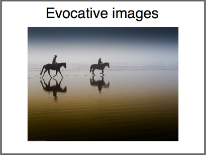
Photo by mikebaird
Notice how much better it looks when the image ‘bleeds’ off the edge of the slide:

Photo by mikebaird
Two Sources of Great Images
iStockphoto.com is a website where you can license high-quality images for a few dollars/pounds each. I use iStockphoto a lot — it offers a wide range of clean and clear images of just about anything you can imagine.
My only criticism of iStockphoto is that the images can be a bit corporate and antiseptic — if you want something a little edgier (and free) then read Skellie’s fantastic tutorial on using Creative Commons images from Flickr: A Complete Guide to Finding and Using Incredible Flickr Images.
Once you’ve got the hang of using Flickr images, I recommend Compfight, an excellent way to search for Creative Commons-licensed images.
Use as Few Words as Possible
Here’s a slide from a presentation I gave a few years ago.
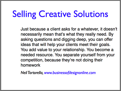
It’s a good quotation, but a terrible slide – faced with me reading this to them, an audience has a choice of either reading the text or listening to me read it. According to Cliff Atkinson in his book Beyond Bullet Points, neuroscientific research has confirmed that it’s impossible for us to take in the same information via two different channels (audio and visual) simultaneously.
But we can easily deal with different information delivered simultaneously through audio and visual channels – such as a documentary film with a spoken commentary.
Think of the presentation room as a cinema, with the slides on the screen acting as visual illustration of the story you are telling. Hopefully this should be a more inspiring setting for your creativity!

Photo by Do u remember
Seth Godin says we should have no more than six words per slide:
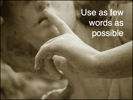
But sometimes even six words is too many:
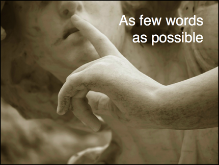
Get into the habit of asking how many words you can cut, for maximum impact:

Or whether you need words at all. Some images speak for themselves:

Give Bullets the Bullet

Photo by Photos8.com
Bullet points work fine within a written document but they make for boring slides. They are usually there as a crutch for the speaker, to help her remember what she has to say. Unfortunately reading bullet points off a slide with the back of your head to the audience doesn’t make for an inspiring presentation.
Here’s another slide from my personal Gallery of Horrors, made a few years ago:
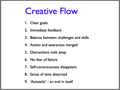
And here’s the version I use now:

Now, when I present using the second slide I may not cover every single one of the nine points in the original, but I give the gist of the subject in a much more lively and engaging way.
Here’s another example – which should make it crystal clear I’m not a graphic designer!
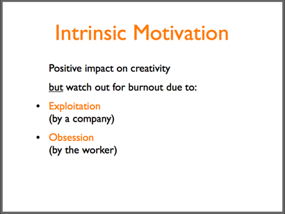
And here’s the latest version. As well as the image, note the use of plain English instead of psychological terminology:

Images Help YOU Remember

Photo by Capitan Giona>
Images that evoke emotions will make your presentation more vivid and memorable for your audience. They will also help you remember the presentation – and not just the facts, but the emotions connected with them.
I remember being a little nervous when I first got rid of bullet points from my presentations. I worried that I’d forget what I had to say. But when each image flashes up on the screen the information pops into my head accompanied by a jolt of emotion, which launches me into the next topic.

Dreaming Up Images
1. When you review the material for each segment of your presentation, notice what images naturally pop into your mind.
Don’t try to be too clever or original – often the most ‘obvious’ images are the most effective, because the audience can easily relate to them. E.g. in the previous section the image of an elephant popped into my mind when I thought of remembering things. My first thought was ‘that’s too corny’ – but it usually gets a laugh, so it seems to work.
2. Search for the images you want on www.compfight.com (remembering to select the ‘commercial use’ option next to the search box) and www.istockphoto.com.
3. If you can create images yourself, go for it! Your own original images will put a unique stamp on your presentations.
Create a Document, Not a Slideument
‘Slideument’ is Garr Reynolds’ term for the printout of slides that is often given to the audience after a presentation. It’s a deliberately horrible word, reflecting the fact that the slideument is a compromise giving the worst of both worlds: because they know the slides will be printed, many presenters cram them with text, which makes them terrible presentation aids; but there isn’t room to explain the ideas properly, so they make an inadequate handout.
Here’s what a slideument of this Presentation Skills workshop would look like:
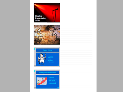
Garr’s solution is to create a separate document with a written summary of the presentation, illustrated with some of the most important images from the slides. Of course, this involves more work – but doing an outstanding job usually involves more work. Your audience will thank you for it – and keep hold of the document (which should of course include your website address and contact details…).
Here’s a snapshot of a pdf document I created for a presentation last year:
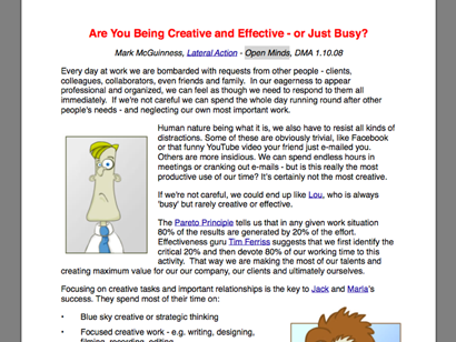
Another benefit of writing out your presentation is that it helps you clarify your thinking and correct any weak points in your argument. I would never read a text to an audience, but once I’ve laid my ideas out in writing I find it much easier to talk fluently about them when I’m on stage.